What will define the most stylish kitchens in 2026? Will homeowners return to white simplicity, or continue exploring unique and colorful designs? As I explore these kitchen backsplash ideas for 2026, I’ll show how material, tone, and texture can completely transform a space. Whether you love modern farmhouse, rustic, or coastal design, the right backsplash can bring personality and balance to your kitchen.
Below are the most inspiring backsplash trends for the year ahead, from white cabinets black countertops pairings to ideas with dark cabinets that feel bold yet timeless.
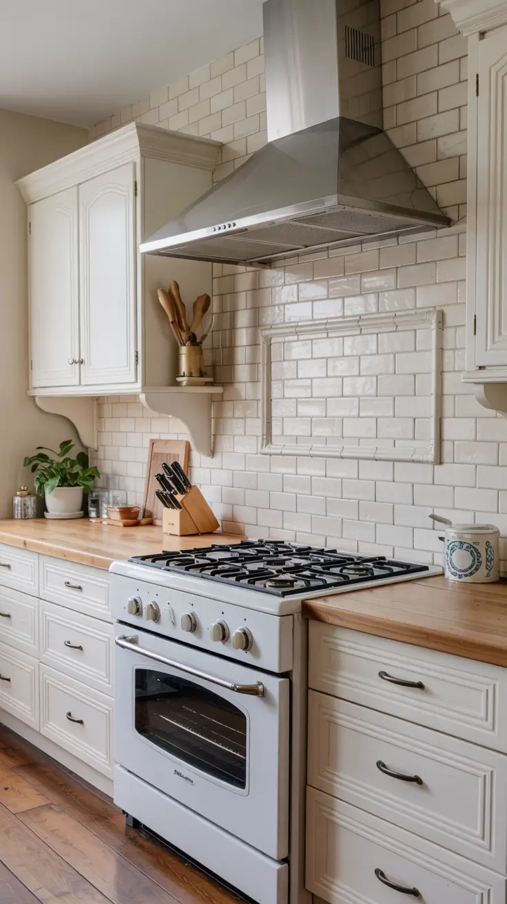
White Backsplash Revival: The Power of Pure Simplicity
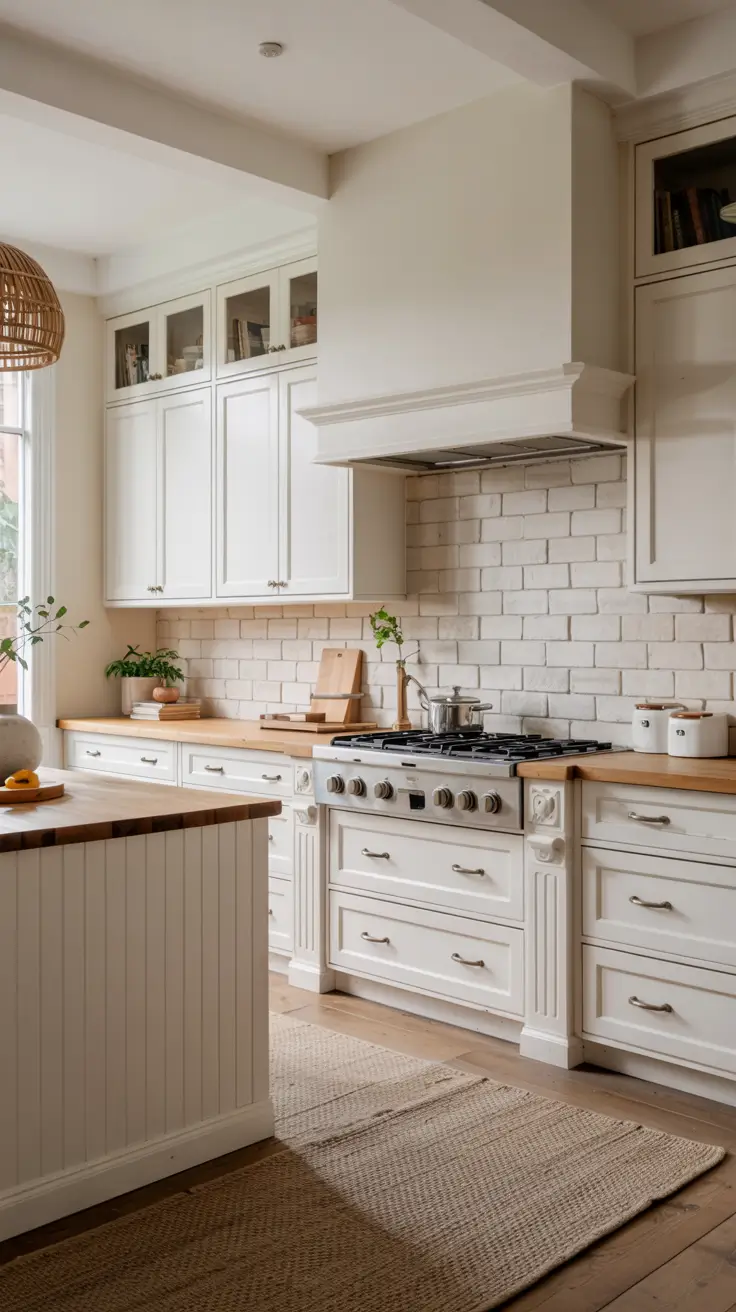
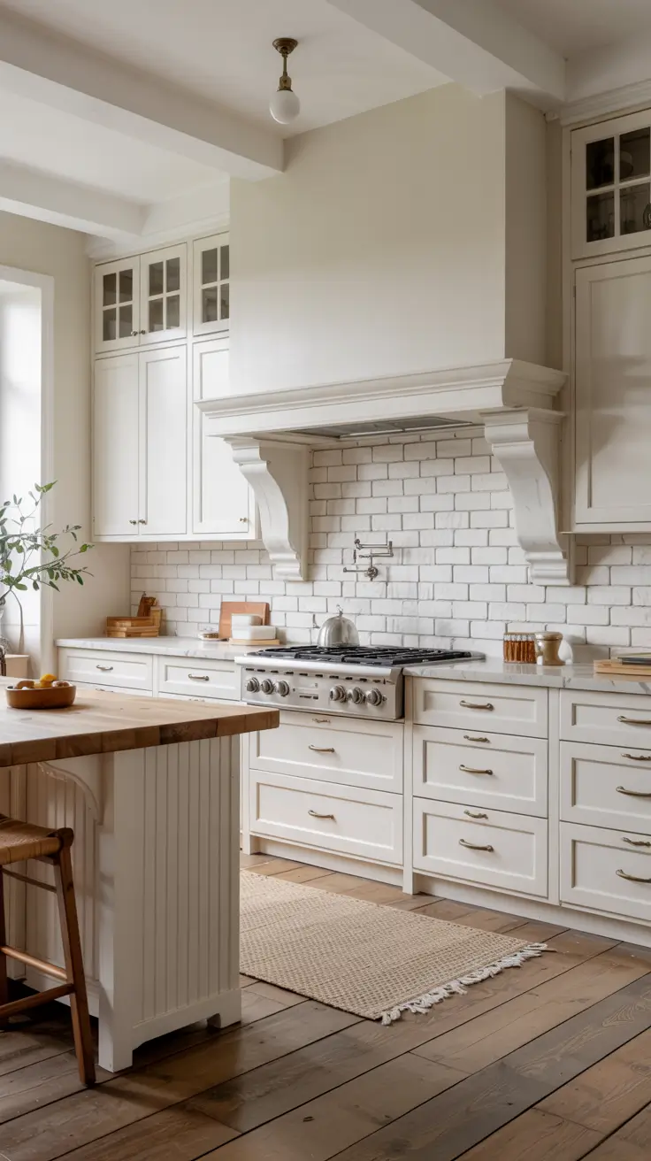
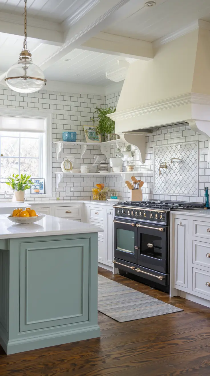
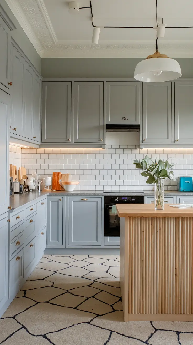
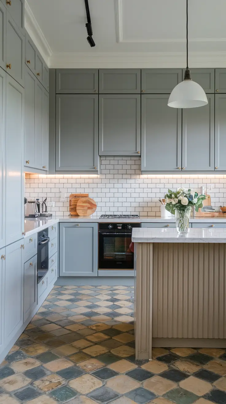
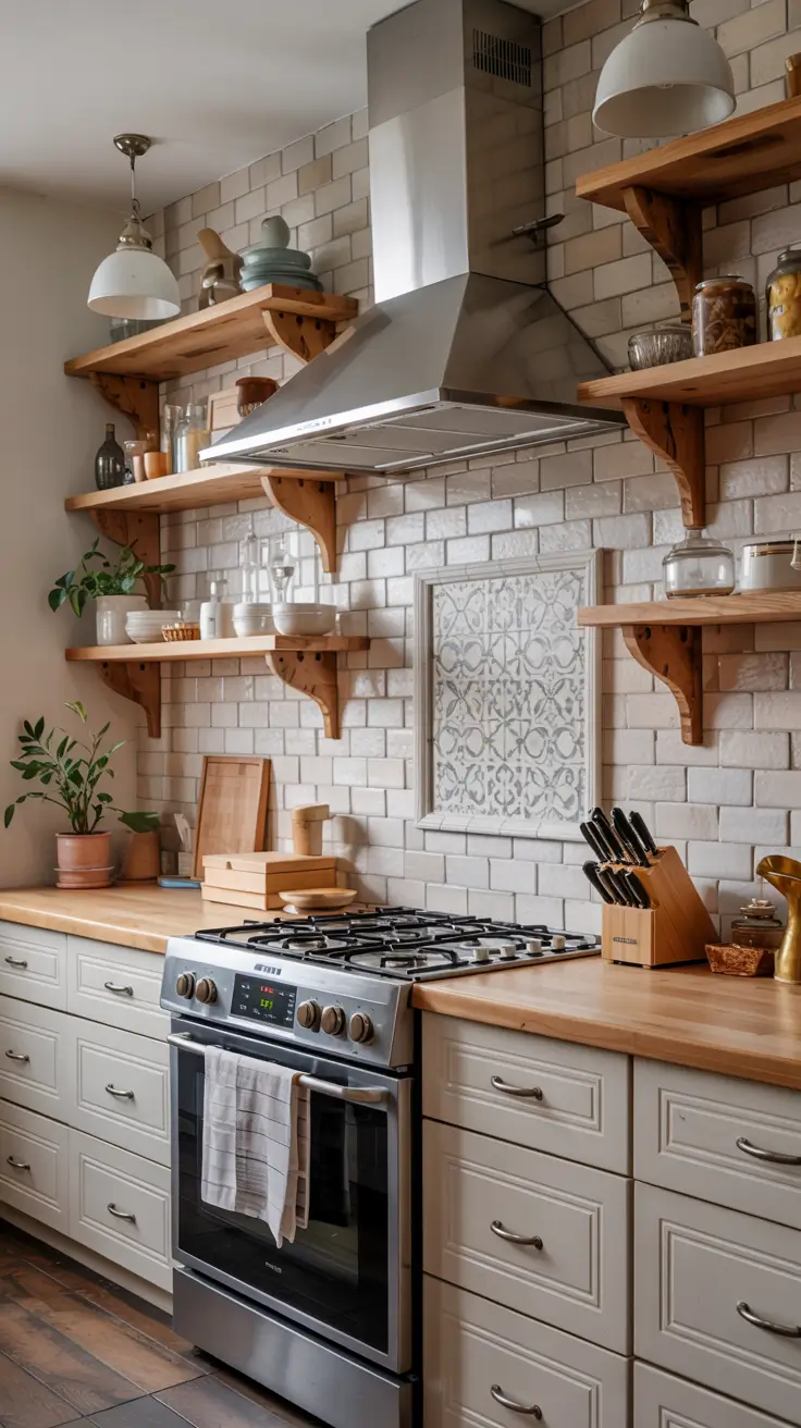
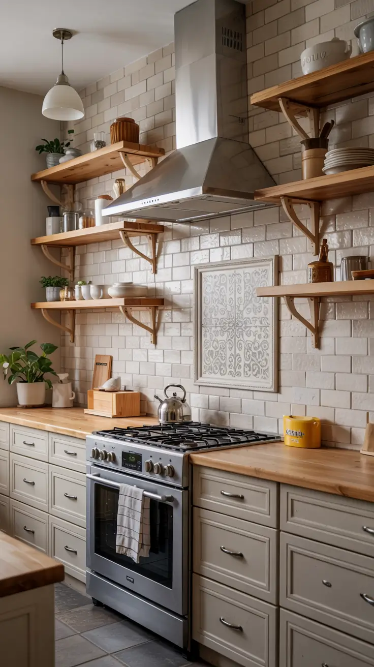
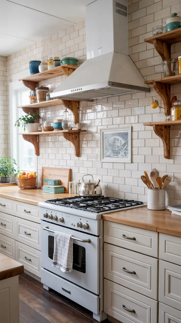
A white backsplash never loses its charm. In 2026, homeowners are embracing the white subway tile look, but with a twist – matte finishes, handcrafted edges, or oversized tile formats. I love this approach because it creates a clean yet textural surface that pairs effortlessly with both modern farmhouse and traditional designs.

For furniture and materials, white cabinets remain the perfect companion. Their crisp tone enhances natural light and allows other elements – like brass hardware or natural stone countertops – to stand out. I often suggest pairing white cabinets black countertops for a dramatic yet balanced look. Open shelving in oak or maple can also bring a touch of earthy warmth.

From my professional perspective, simplicity like this always feels timeless. According to Architectural Digest, white-on-white kitchens are making a strong comeback due to their adaptability and resale value. Personally, I find them ideal for smaller spaces where light reflection is key.
I’d add that incorporating under-cabinet LED lighting and patterned grout could elevate this design further. Subtle details make a big difference in creating a fresh, modern inspiration.
Unique Backsplash Concepts for a Standout Kitchen
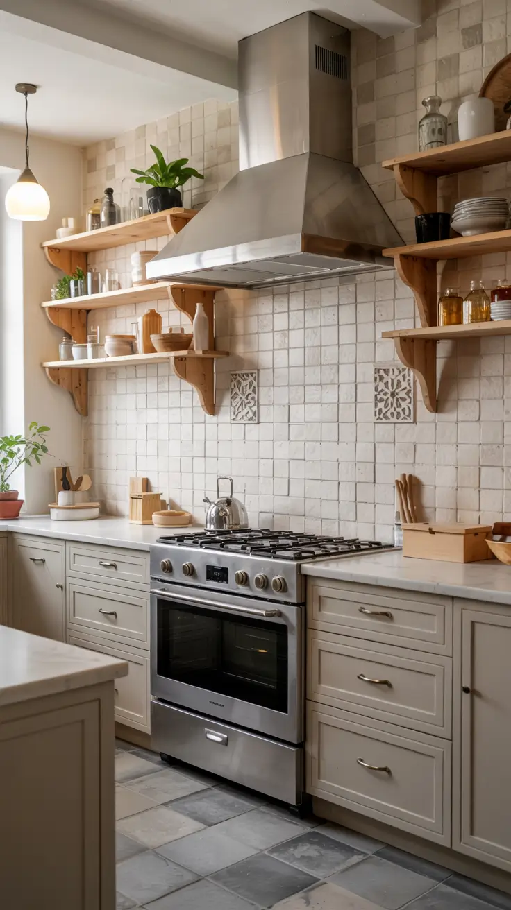
For 2026, unique backsplash concepts go beyond tiles – think mosaic, Zellige tile, or even back-painted glass. I appreciate how these materials bring texture and dimension to the walls, making them the kitchen’s visual centerpiece. Every home can benefit from one daring design element.
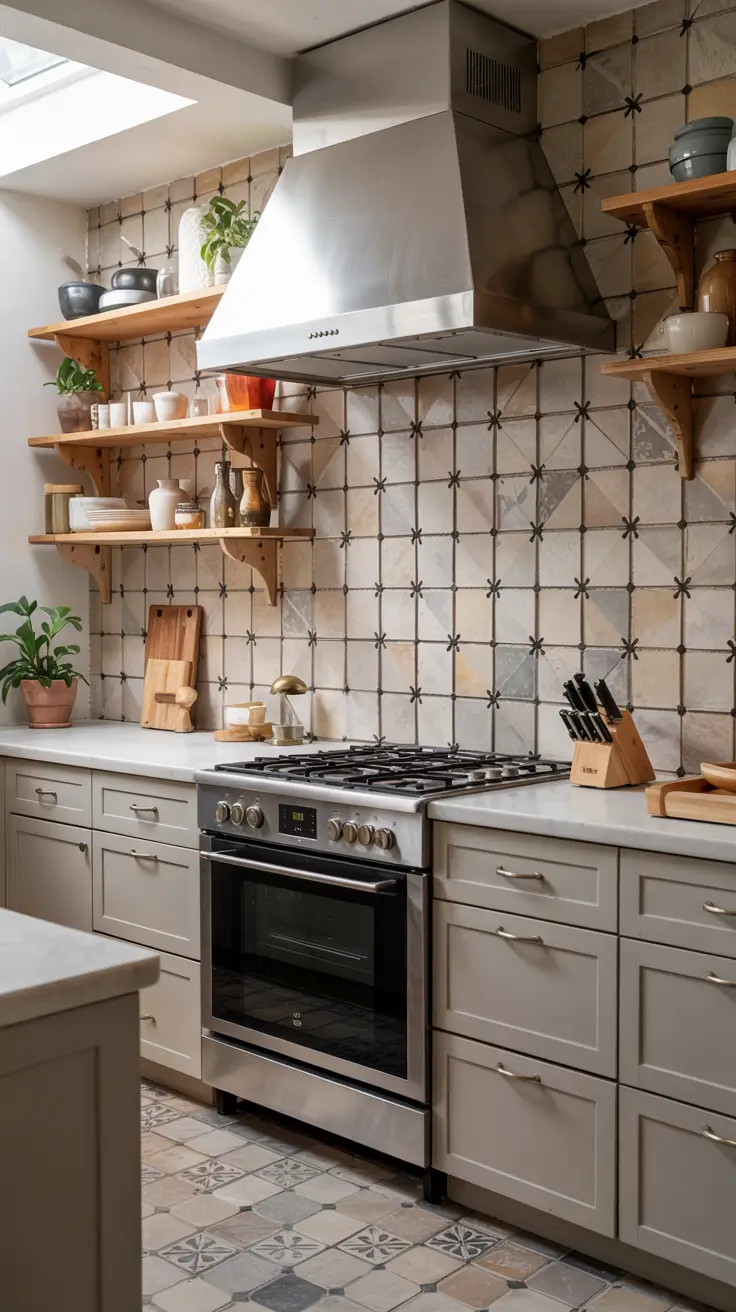
I recommend combining these materials with neutral cabinetry to let the backsplash shine. Grey cabinets or sage green cabinets provide balance, especially when paired with soft lighting and minimalist handles. These tones enhance the patterned tiles beautifully without overwhelming the space.
From my own design experience, a unique backsplash tells your story. In an interview with Elle Decor, designer Kelly Wearstler mentioned that tilework is “an opportunity to express individuality.” I agree wholeheartedly – even a small wall section can showcase personality through texture or shape.
Adding more decorative elements like open shelving or warm metallic accents could make the look feel complete. Always ensure the backsplash complements, rather than competes with, your main color palette.
Pairing White Cabinets with Modern Backsplash Designs
Ideas white cabinets continue to dominate 2026 kitchens. However, pairing them with modern backsplash materials like stone, porcelain slabs, or white subway tile in herringbone patterns gives them fresh life. I’ve seen homeowners use full-height slabs for a sleek, continuous effect that feels minimalist yet luxurious.
The beauty of white cabinets lies in their versatility. You can pair them with soft grey, blue, or green tiles to inject personality without losing brightness. I love using matte Zellige tile for handcrafted texture or beadboard panels painted in creamy tones for a cottage vibe.
From experience, modern pairings should balance light and depth. As interior stylist Emily Henderson once said, “White kitchens need warmth somewhere.” Adding wooden bar stools or oak cabinets in the island base can bring that needed natural balance.
I might add wall sconces above the backsplash or subtle veined stone accents to complete this look. These small choices define a polished, contemporary space.
Backsplash Ideas for Brown Cabinets: Warm and Welcoming
Brown cabinets evoke comfort and richness, and the right backsplash enhances that feeling. I find ideas brown cabinets shine best when paired with cream subway tile, soft earthy tones, or handmade Mexican tile. These combinations feel natural yet sophisticated.
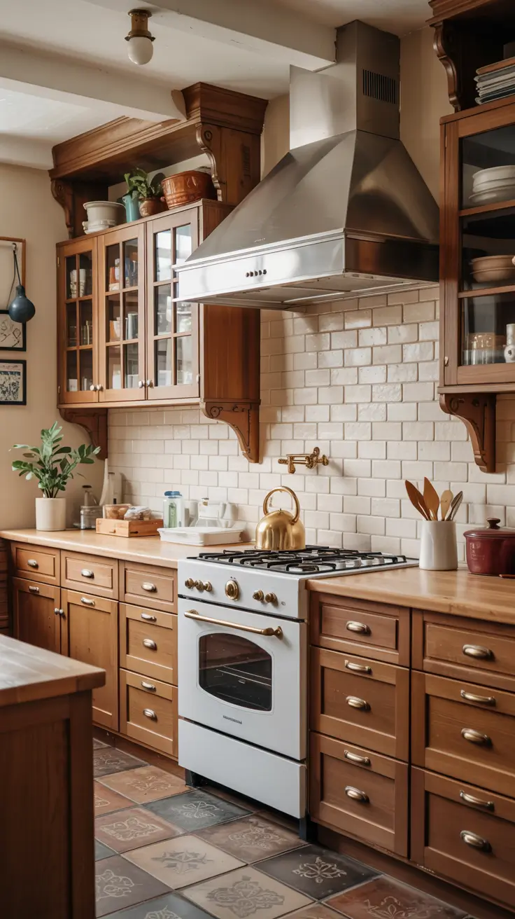
In my designs, I often recommend combining brown cabinets with light neutral countertops and patterned tiles to balance the heaviness of the wood. Brushed nickel or antique brass fixtures complement the tone perfectly. Incorporating warm lighting amplifies the inviting, homely feeling.
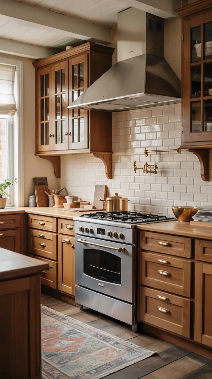
Personally, I believe brown cabinets are underrated. In Better Homes & Gardens, experts predict a return of rich wood tones for 2026, reflecting a growing appreciation for organic textures. They’re timeless and grounding, perfect for a cozy kitchen setting.
Adding greenery, such as potted herbs or small country-style décor, enhances the warmth. It’s an easy yet effective way to complete this design concept.
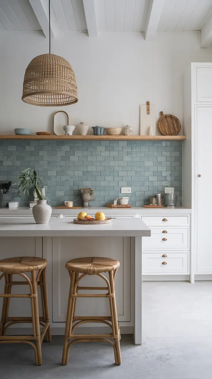
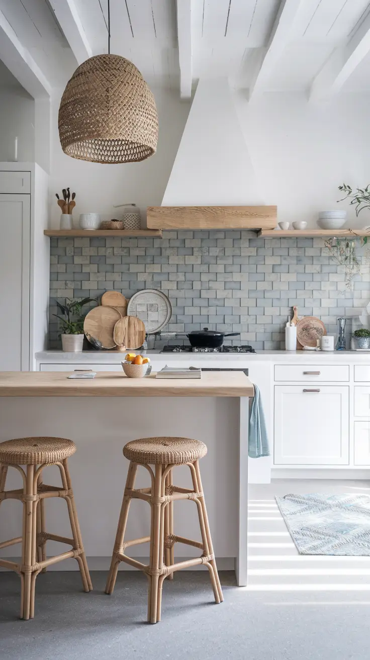
Coastal Kitchen Vibes with Sea-Inspired Backsplashes
A coastal backsplash design transforms any kitchen into a breezy seaside retreat. I often use shades of blue, aqua, or soft grey glass tiles to recreate the calming rhythm of the ocean. Pairing these with white cabinets or oak cabinets keeps the design light and airy.
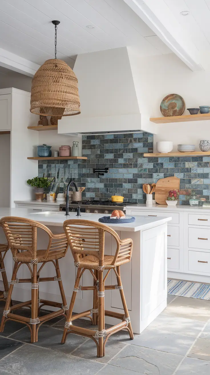
In terms of décor, woven pendants, driftwood shelving, and linen curtains emphasize the relaxed coastal spirit. Natural stone counters, rattan bar stools, and brushed steel fixtures complete the look. Every piece should evoke the simplicity of beach living.
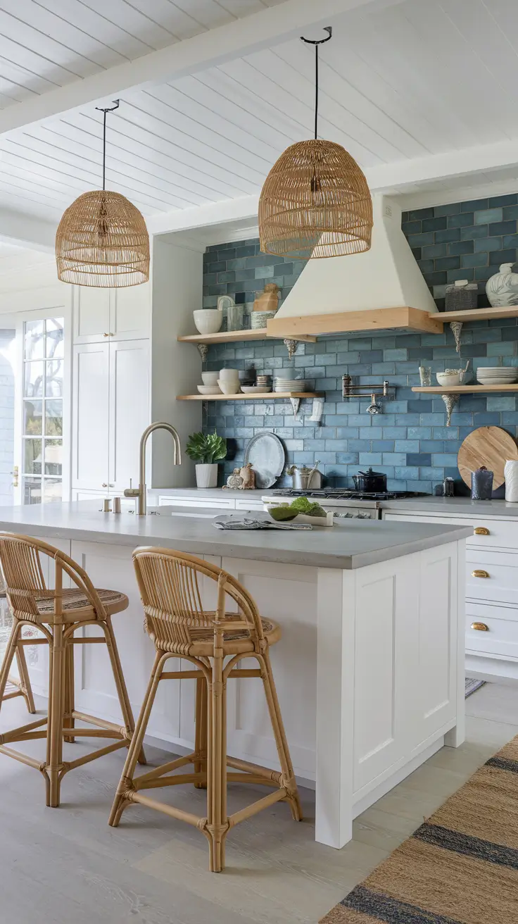
As I’ve learned from coastal designers in House Beautiful, layered neutrals and reflective materials are key to achieving this aesthetic. I’ve applied this idea in several homes, and it always brings balance between comfort and freshness.
For improvement, I’d consider adding shell-inspired mosaic tiles or a subtle patterned detail above the stove to draw the eye without losing harmony.
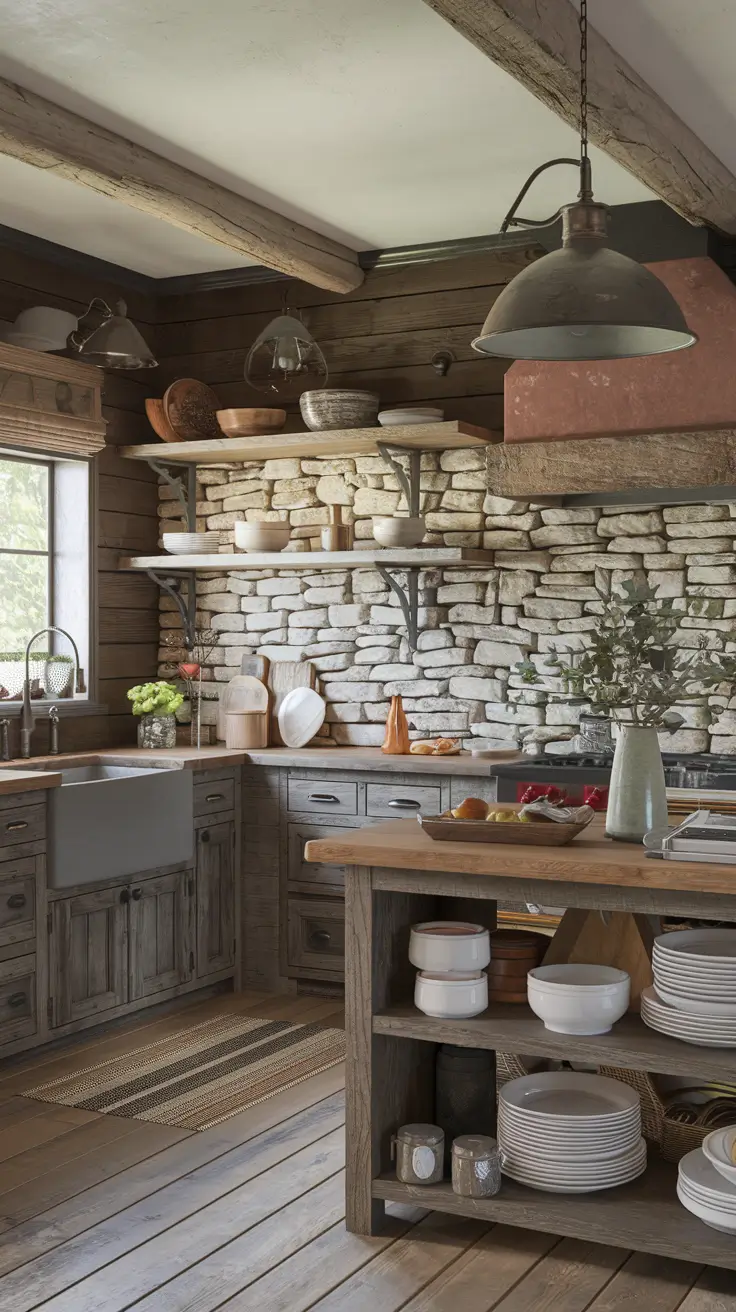
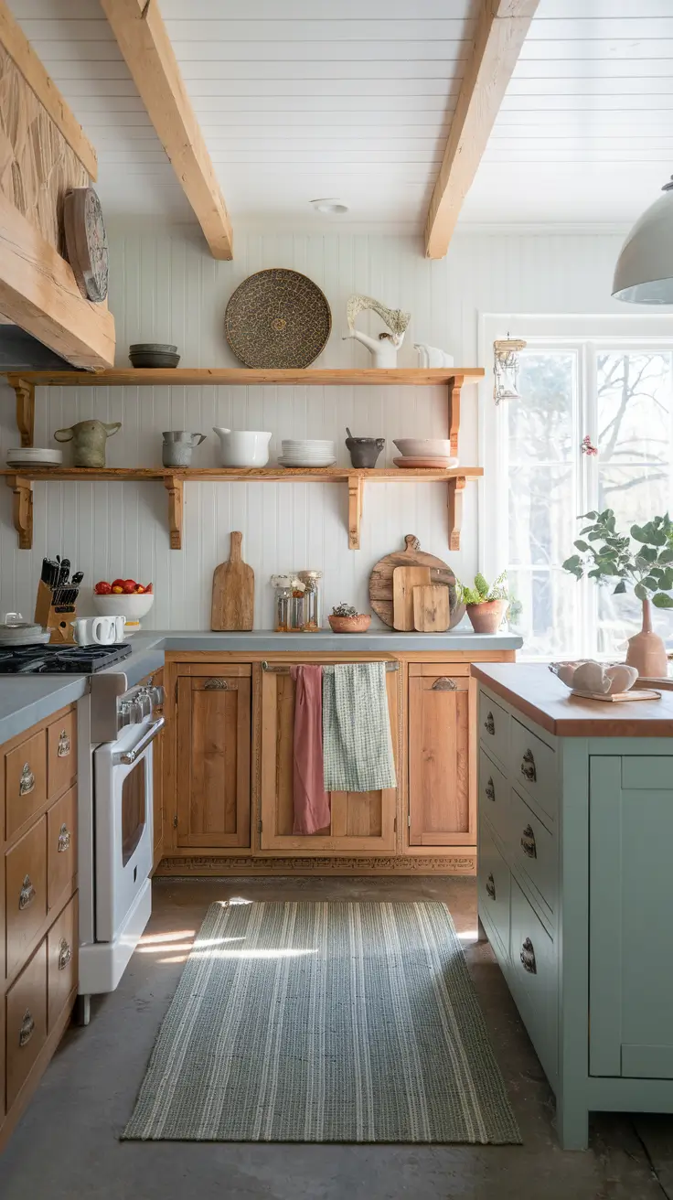
Rustic Backsplash Designs that Bring Character Home
The rustic look remains a favorite in 2026, especially among modern farmhouse lovers. I personally enjoy working with stone, brick veneer, or shiplap backsplashes for their authentic texture. They make a kitchen feel grounded and timeless.
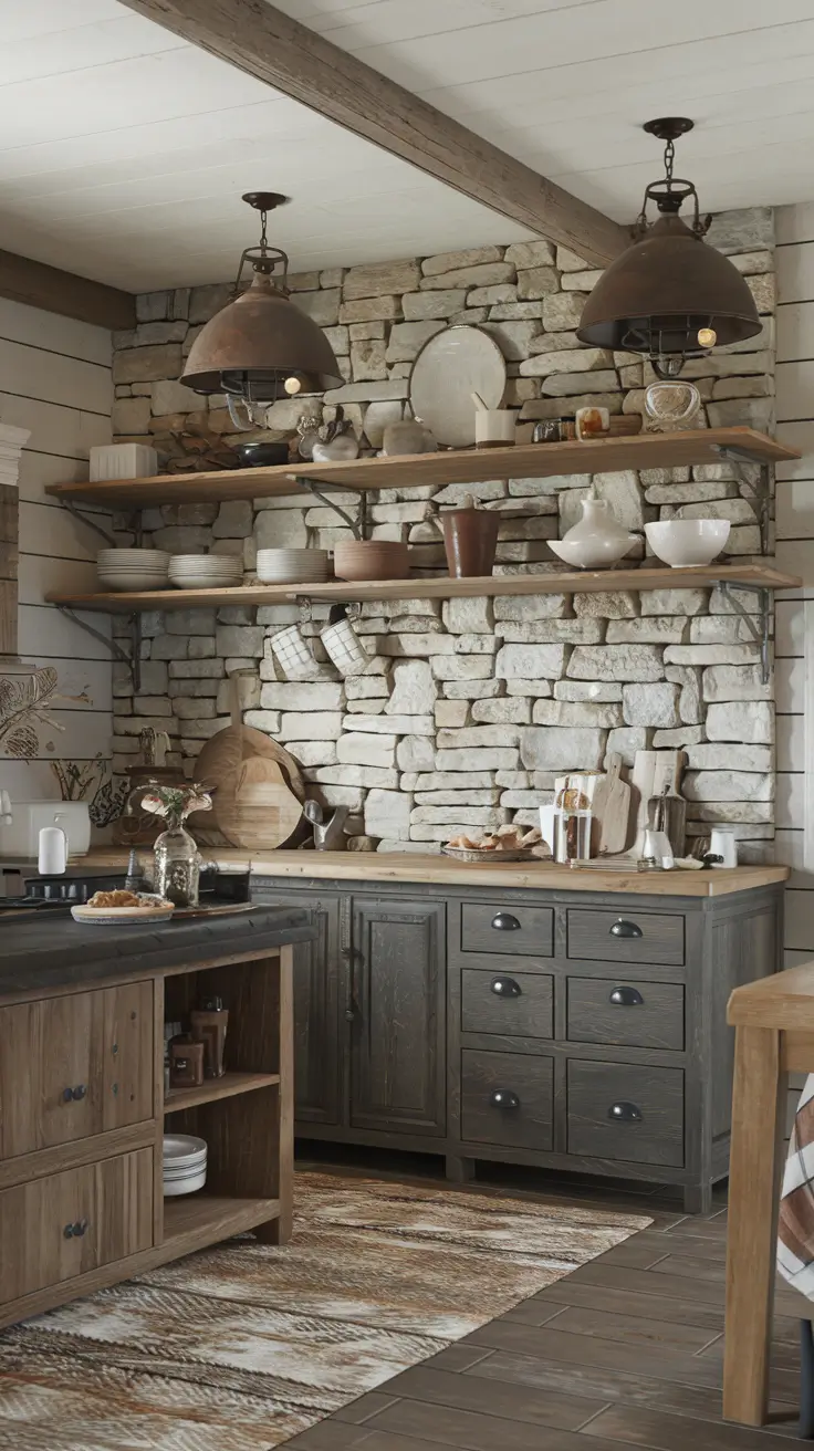
Wood cabinets or dark cabinets pair beautifully with rustic textures. Add beadboard panels, open wooden shelving, or distressed finishes to heighten the cozy effect. Iron hardware and earthy paint colors add to the character of this charming style.
I’ve often found that clients drawn to rustic farmhouse design value warmth and storytelling in their spaces. As Joanna Gaines once said, “Rustic design is about layers of life.” Each imperfection adds authenticity.
I’d include additional pendant lighting and woven accents to finish this section. These touches introduce warmth without overpowering the rustic foundation.
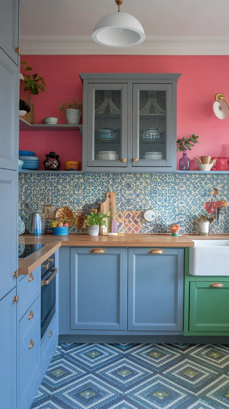
Colorful Backsplashes to Energize Your 2026 Kitchen
A colorful backsplash can transform a neutral kitchen into a work of art. I often recommend mosaic, Zellige tile, or even patterned ceramic designs for homeowners who crave energy and vibrancy. The key is to balance bold tones with simple cabinetry.
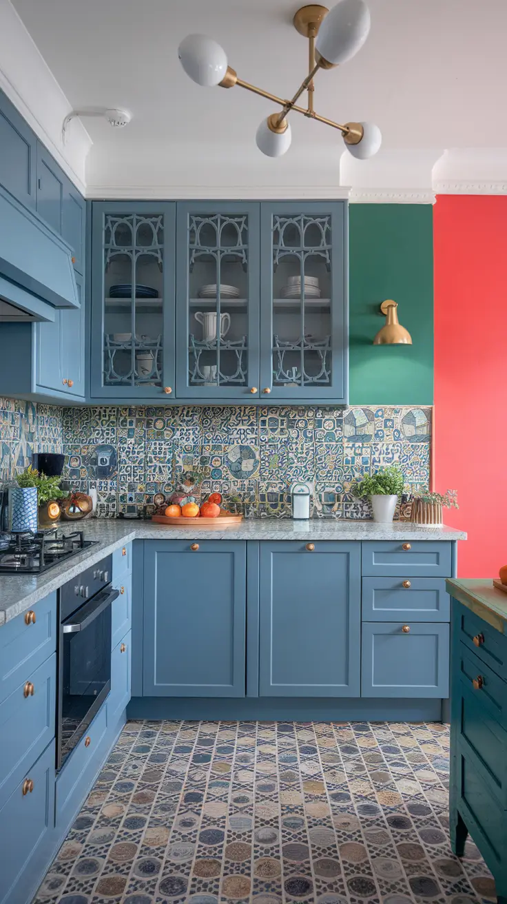
For instance, grey cabinets or white cabinets let bright green, blue, or coral hues stand out. If the space features dark cabinets, lighter shades on the walls can create contrast and prevent heaviness. This combination adds instant personality and joy to daily routines.
From my design perspective, color should be intentional. Experts at Veranda highlight that saturated tones are trending in 2026, especially in kitchens seeking individuality. I fully agree – a splash of color can uplift even the most modest layouts.
To refine this section, I’d add advice on integrating colorful backsplashes with neutral flooring or subtle décor to maintain harmony.
Oak Cabinet Backsplash Pairings for a Natural Aesthetic
I love how oak cabinets ground a kitchen with a calm, earthy presence while still feeling fresh for 2026. When I pair oak cabinets with a backsplash, I lean into stone, Zellige tile, or subtly patterned porcelain that echoes the grain without competing with it. This approach keeps the palette neutral and airy so the room reads warm rather than heavy, and it works equally well in cottage, modern farmhouse, or traditional kitchens.
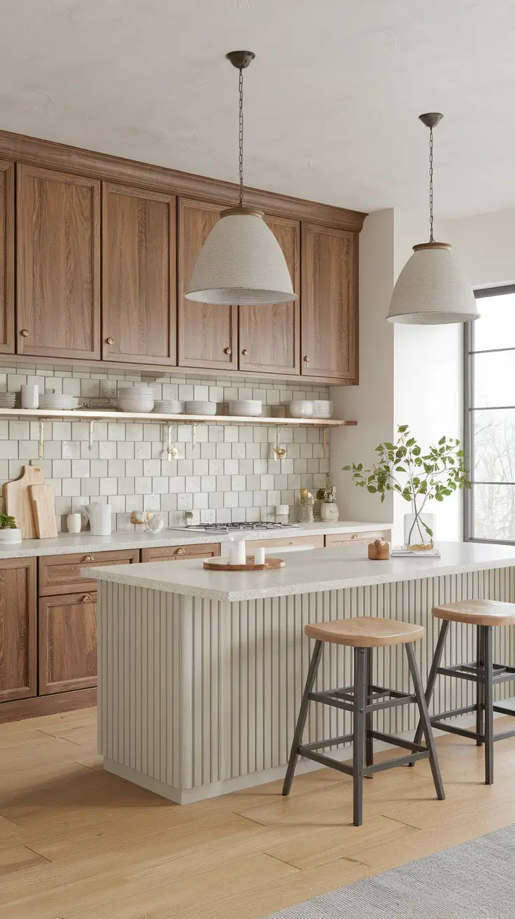
For materials, I specify tumbled stone in soft beige, white subway tile with warm grout, or handcrafted Zellige tile in pale green or blue to add gentle movement. I often layer beadboard on the island or shiplap on a feature wall to bridge textures. Brushed brass pulls, a matte black faucet, and linen pendants round out the composition, while wide plank floors reinforce an earthy rhythm.
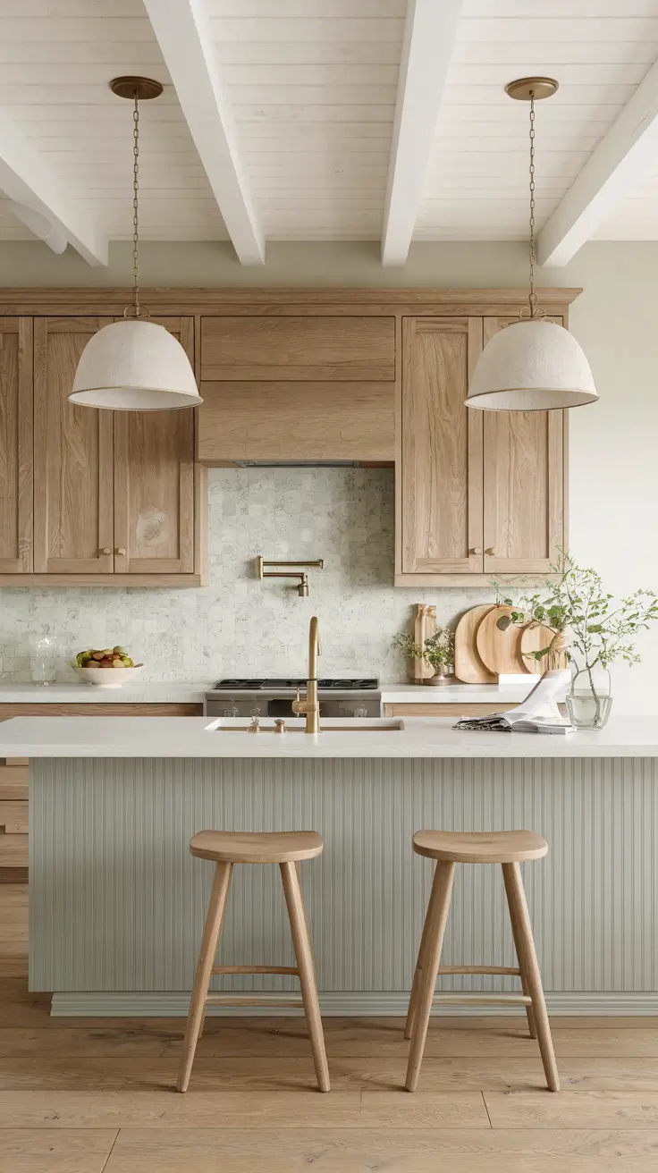
From experience, ideas oak cabinets succeed when the backsplash introduces just enough texture to highlight the wood. Designers frequently suggest tempering oak with neutral counters and lighter walls to avoid visual clutter, and I agree. If a client wants more color, I introduce sage green cabinets for a pantry run or a blue range to create a soft focal point.
What I would add is a single patterned accent panel behind the cooktop to offer a dose of personality. It might be a mosaic insert in creamy whites or a subtle geometric that nods to nature. That one detail can make the entire space feel curated rather than expected.
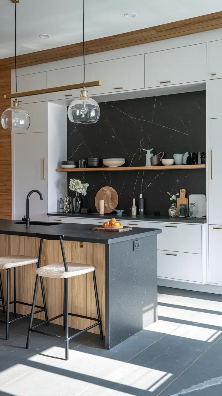
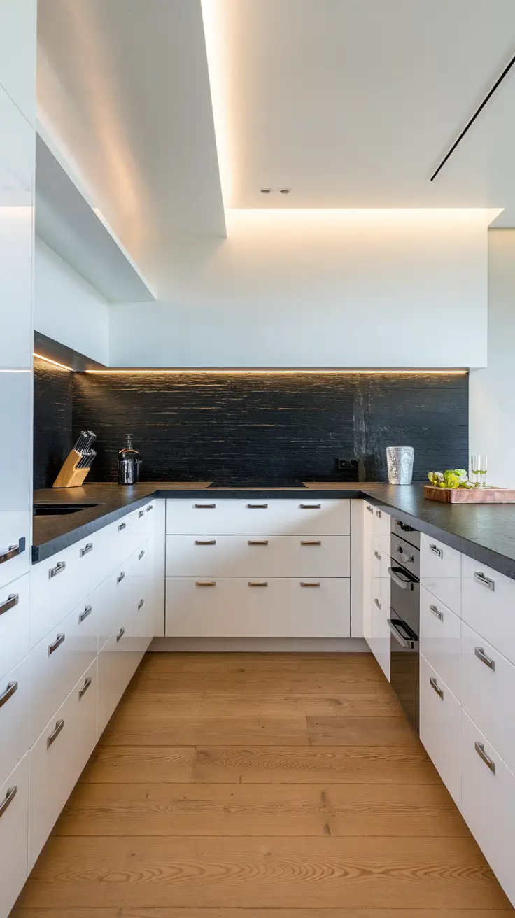
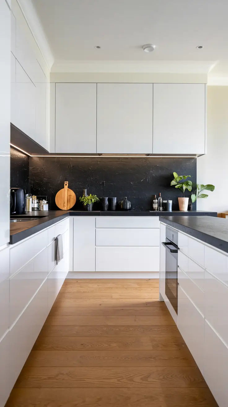
Dark Cabinet Backsplash Combinations that Dazzle
When clients ask for ideas with dark cabinets, I focus on balance and reflection. Dark cabinets in espresso or charcoal can look stunning if the backsplash brings light back into the room. I like pairing dark cabinets with white subway tile, glossy mosaic, or a lightly veined stone slab that brightens the vertical plane and keeps the kitchen from feeling closed in.
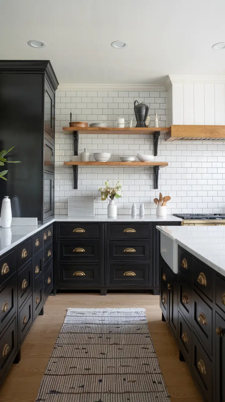
I specify polished stone like quartzite with soft white veining, vertically stacked subway tile for a modern line, or a pearlescent mosaic that bounces light. Hardware in warm brass, stools in natural wood, and open shelves in oak help soften the transition between dark and light. If the perimeter is dark, I often recommend a lighter island to break up massing.
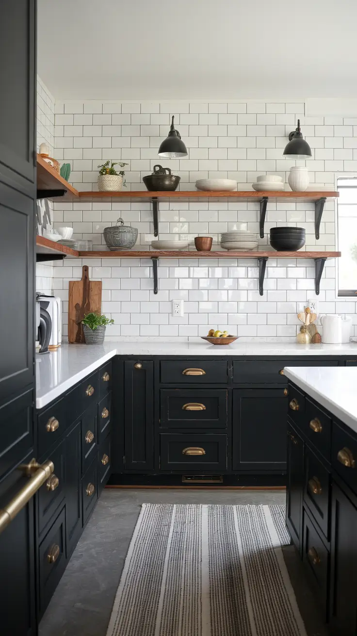
In my practice, I have found that a black and white scheme around dark cabinets feels timeless and crisp. Many stylists suggest layering neutral textures rather than more color, which prevents the room from skewing busy. I follow that guidance and reserve color for flowers, textiles, or art.
To complete this concept, I would add under cabinet lighting and a reflective range hood finish. These details accentuate the backsplash surface and ensure the dark elements look intentional rather than overpowering.
Dark Backsplash Styles for Bold Kitchen Statements
A dark backsplash is dramatic and modern, and I use it when a client wants a strong architectural spine in the room. Matte black porcelain, dark soapstone, or midnight blue ceramic tile can create a gallery backdrop for wood and metal accents. With the right lighting, a dark backsplash reads as sophisticated rather than severe.
I like oversize porcelain panels with minimal seams, charcoal zellige with handcrafted variation, or a patterned dark and grey mosaic for richness. Pairing these with white cabinets black countertops flipped to black counters on an island or mixing in wood cabinets introduces warmth. Linear sconces and clear glass pendants direct light across the surface so the depth reads clearly.
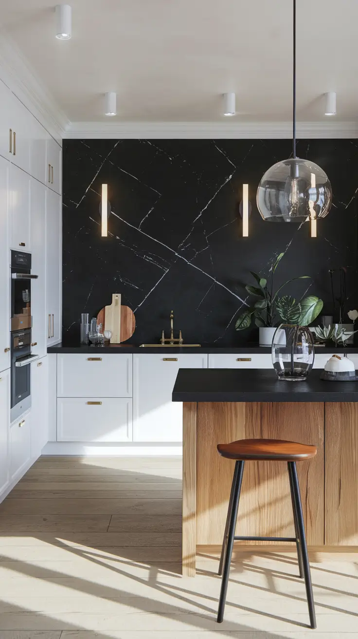
From my perspective, a dark backsplash thrives with contrast. If the kitchen has dark cabinets, I often introduce a white counter and a neutral floor to stabilize the palette. If the cabinetry is light, I might choose a black faucet or black hardware to tie the story together.
What I would add is a gentle texture shift, like ribbed tile or fluted stone behind the range. Subtle relief gives the surface movement and prevents a flat wall of color, which is especially helpful in smaller kitchens.
Wood Cabinet Backsplashes that Blend Texture and Tone
Wood-on-wood kitchens are trending, and I sometimes specify a wood backsplash to create a continuous envelope of warmth. The key is moderation and protection. I lean toward sealed beadboard, vertical-grain oak panels, or narrow slats treated for moisture so the surface is practical near cooking zones.
I pair wood backsplashes with stone counters for contrast and durability. Country or French country elements like curved pulls, ceramic crockery, and woven textures keep the look soft. If the main run is oak, I might use painted grey cabinets or sage green cabinets on an island to vary tones without breaking harmony.
Professionally, I find that wood backsplashes shine when surrounded by abundant natural light and disciplined lines. Many experts recommend limiting wood behind the range to an easy-to-clean insert of tile or stone, which I often do. This hybrid solution keeps the look cohesive while remaining realistic for daily cooking.
To round out this section, I would add a slim tile frame or metal rail above the cooktop. This small protective band preserves the wood and adds a crafted detail that looks intentional and timeless.
Blue Backsplash Trends for Calm, Cool Interiors
Blue is the versatile color I return to for calm energy. A blue backsplash reads coastal in paler tones and modern in deeper hues. In 2026, I am seeing watercolor glazes, hand pressed ceramics, and linear mosaics in mid to light blue that sit beautifully with oak cabinets or white cabinets.
I like to specify glazed subway tile in misty blue, stacked vertical rectangles in denim tones, or a soft mosaic gradient that shifts from blue to white. Hardware in brushed nickel, stools in rattan, and a stone counter with gentle veining reinforce the relaxed mood. If a client wants more color, I add green accessories for a sea glass palette.
From experience, blue can bridge multiple styles. It feels coastal, cottage, or modern farmhouse depending on the surrounding finishes. Publications frequently note that blue kitchens enjoy steady appeal because the color is both uplifting and neutral adjacent, which matches what I see in long-term client satisfaction.
I would add a framed niche with patterned inlays or a single strip of Mexican tile above the range to personalize the composition. This accent maintains the calm base while offering a memorable moment.
Black and White Backsplash Patterns for Timeless Contrast
Black and white patterns are an enduring route to clarity and rhythm. I use classic checkerboard mosaics, geometric encaustic looks, or graphic marble inlays to draw the eye without relying on bright color. The result is timeless contrast that pairs well with white cabinets, grey cabinets, or dark cabinets.
For components, I might specify marble mosaic with black accents, white subway tile arranged in a herringbone field with black pencil liners, or a patterned porcelain behind the range only. A neutral counter, wood stools, and an oak shelf soften the contrast so it feels inviting rather than stark. Matte black fixtures tie everything together.
In my work, black and white succeeds when pattern scale fits the room size. Larger patterns need more wall to breathe, while smaller mosaics suit compact kitchens. Many editors recommend repeating black in two or three places so it feels integrated rather than random, a guideline I follow closely.
To enhance the section, I would add dimmable task lighting. Being able to dial brightness ensures the pattern looks crisp for prep and soft for entertaining, which extends the room’s versatility.
Sleek Black Backsplash Ideas for Modern Kitchens
A black backsplash can be the clean line that makes a modern kitchen feel intentional. I like stone slabs in honed finishes, high gloss porcelain, or ultra-thin sintered panels. These surfaces photograph beautifully, are easy to maintain, and give cabinetry a sculptural backdrop.
I often pair black slabs with white cabinets or oak cabinets to balance temperature. Minimal hardware, integrated pulls, and thin-profile counters keep the silhouette tidy. For a traditional or transitional space, I might add beadboard on the island base or wood panels in the breakfast nook to soften the contemporary edge.
From a practical standpoint, black hides minor splashes and pairs well with stainless or black appliances. Many design voices point out that black benefits from layered lighting, and I agree. A mix of recessed, under cabinet, and decorative fixtures ensures depth and clarity on the surface.
I would add a single glass shelf or a slim ledge rail in brushed steel along the slab. This small functional element supports spices or art without interrupting the strong horizontal flow.
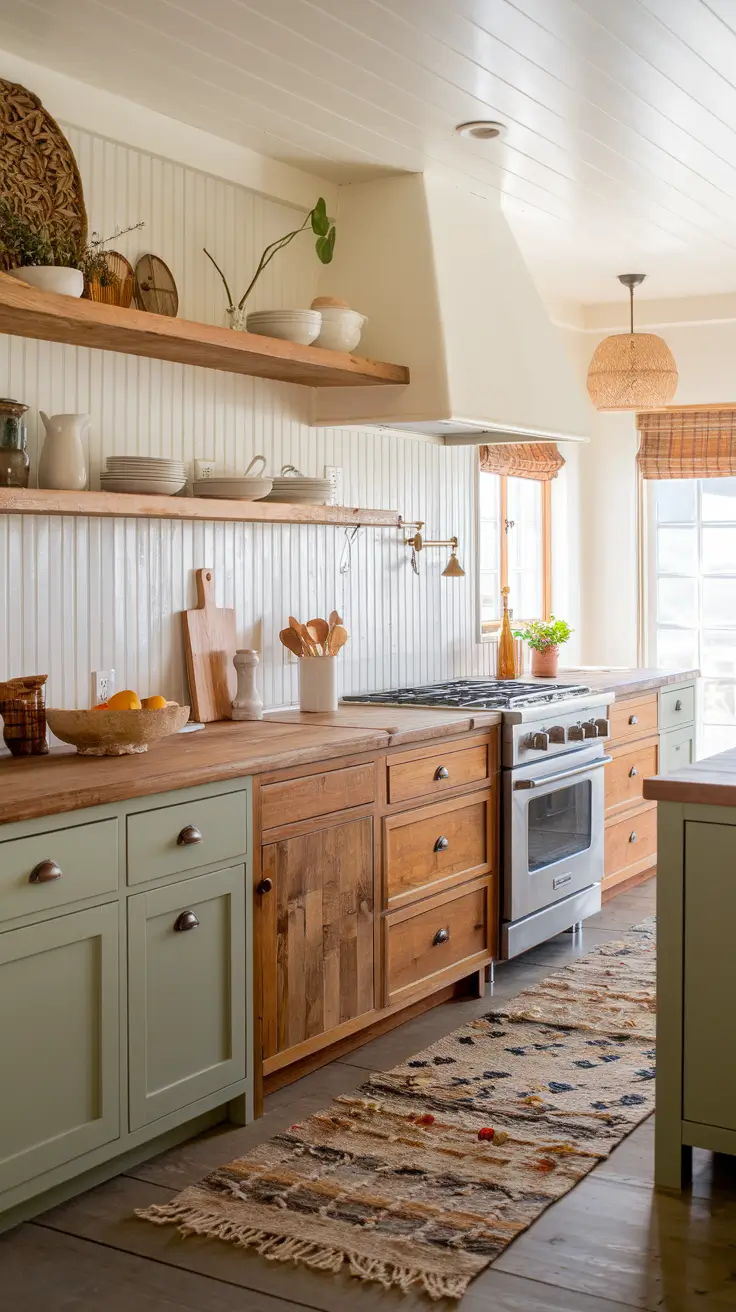
Country Kitchen Backsplashes with Vintage Charm
I like to start a vintage country scheme with a backsplash that feels collected over time. Creamy off-White field tile with hand-pressed edges immediately reads Country and works beautifully with Wood cabinets or Oak cabinets. If the room needs more warmth, a narrow rail of bead-mold trim or Beadboard panels as a short backsplash adds texture without feeling busy. I keep the palette Neutral with small hints of Blue or Green so the look stays Timeless rather than theme-y.
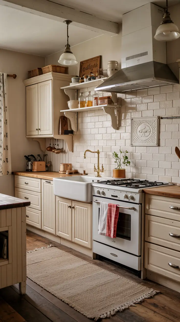
For the supporting cast, I specify a farmhouse apron-front sink, a bridge faucet in unlacquered brass, and butcher-block counters for coziness. If the home already has Brown cabinets, I balance their depth with a lighter cream tile and a slim Shiplap range wall for shadow lines. With White cabinets, I sometimes introduce a Colorful hand-painted Mosaic band behind the cooktop for a Unique focal point. Antique-style glass pendants, a vintage rug runner, and simple peg rails complete the scene without clutter.
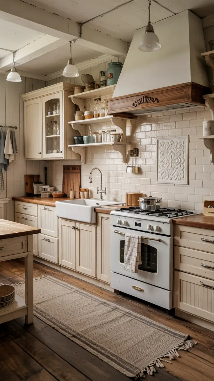
From experience, restraint is key. I have installed kitchens where too many patterns competed – a Patterned floor, a busy countertop, plus Mosaic tile was simply too much. Multiple editors at major US shelter publications often advise choosing one hero texture and letting everything else support it. I follow that rule here: one hero, everything else quiet.
What I would add is a clear maintenance plan. If you cook daily, choose a satin or eggshell paint finish on Beadboard and seal grout to make splatters easy to wipe. If you want a patina-forward look, let brass and wood age naturally rather than over-polishing.
Traditional Backsplash Designs That Never Go Out of Style
In a Traditional kitchen, proportion and symmetry do the heavy lifting. I lean on White subway tile or beveled Subway tile laid in a classic running bond with a medium-light grout. It pairs effortlessly with White cabinets, Black and white marble, and even Dark accents. For clients wanting depth, I add a framed herringbone panel behind the range – still Traditional, still Timeless.

Cabinet colors set the mood. With Grey cabinets, a crisp White subway tile keeps things airy; with Dark cabinets or Dark cabinets paired with Black hardware, I specify a warmer white tile and a marble or Stone slab behind the range to soften contrast. Crown molding, panel-ready appliances, and polished nickel taps underline the refined feel, while a restrained Blue or Sage green island can provide gentle color without straying from tradition.
I have revisited Traditional kitchens I designed ten years ago and the ones that age best keep the backsplash quiet. Industry pros often note that a classic field tile with balanced grout lines will outlast fads and is easy to repair. I agree – availability and replaceability are underrated design criteria.
If anything is missing, it is art. Add a small still-life in an oil frame on a shelf or an easel stand on the counter. It injects personality while staying within the Traditional vocabulary.
Outdoor Kitchen Backsplashes Built for Beauty and Durability
Designing an Outdoor kitchen for 2026 means picking materials that handle sun, rain, and temperature swings. I like porcelain or dense Stone-look porcelain for the backsplash because it resists fading and is easy to hose down. If the home has a Coastal vibe, a soft Grey or Blue plank-look porcelain tile nods to boardwalk texture without the upkeep of real wood.

I pair the backsplash with marine-grade stainless appliances, a sealed-granite or porcelain-slab counter, and cabinet boxes rated for exterior use in either powder-coated metal or teak. With Outdoor bars, I sometimes choose Zellige tile only under covered areas, reserving more weatherproof finishes for fully exposed walls. Task sconces with wet-location ratings and a ceiling fan keep the space functional during hot months.
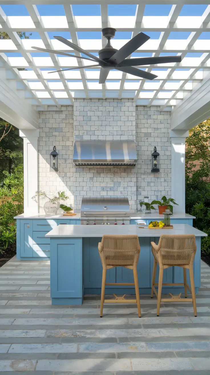
Having repaired cracked grout in seaside kitchens, I favor larger-format tiles to reduce joints. Experts in outdoor living frequently recommend UV-stable sealers and flexible mortars; I specify both. A short roof extension or pergola slat above the grill line can also shield heat and grease from the wall, prolonging finish life.
To round out the plan, I would add a hose bib or utility sink and a discreet storage niche for grill tools. These small details keep the Outdoor kitchen tidy and enjoyable year-round.
Grey Backsplashes for Effortless Sophistication
Grey remains a versatile neutral, especially when you want quiet luxury without going fully Dark. I like a soft dove Grey glazed tile with subtle variation – it flatters Grey cabinets and balances Black hardware, Black ranges, and stainless hoods. In bright rooms with White cabinets black countertops, a mid-tone Grey backsplash bridges the contrast beautifully.

For the rest of the palette, I layer warm metals and natural textures so Grey does not feel cold. Think brushed brass knobs, linen Roman shades, oak open shelves, and a wool runner. With Dark cabinets, I choose a lighter Grey tile in a vertical stack to lift the walls. With Oak cabinets, I often specify a cooler Grey to tame yellow undertones.
In practice, the trick is mixing cool and warm Greys mindfully. I bring samples into the actual room light and check them against counters in morning and evening. Many design editors advise this daylight test, and it consistently prevents surprises after installation.
What I would add is a tactile element. Consider a ribbed or fluted Grey ceramic behind the range for depth while keeping the field tile smooth elsewhere for easy cleaning.
Earthy Toned Backsplash Ideas for Natural Harmony
Earthy tones – clay, sand, olive, and terracotta – feel grounded and calming. I like matte porcelain or Stone with a honed finish to minimize glare and fingerprints. These hues play nicely with Brown cabinets, Oak cabinets, and Rustic farmhouse or Cottage envelopes. If the home leans Modern farmhouse, I keep lines simple and let the material do the talking.

Complements matter. I specify unlacquered brass or blackened steel hardware depending on whether the palette skews warm or cool. Sourcing rugs with Earthy stripes and adding plaster or limewash walls deepen the natural vibe. With Sage green cabinets, an ecru or putty-toned backsplash ties the look together. For White cabinets, a sandy clay tile warms the room without reading too Colorful.

I have seen clients fall in love with saturated terracotta only to worry it will date. My approach is to use terracotta as a framed panel or short wall segment, then keep the rest Neutral. That way, the Earthy note feels deliberate and not overpowering.
I would add indoor plants and organic ceramics to echo the palette. A ledge shelf in oak with handmade mugs reinforces the natural harmony and provides daily pleasure.
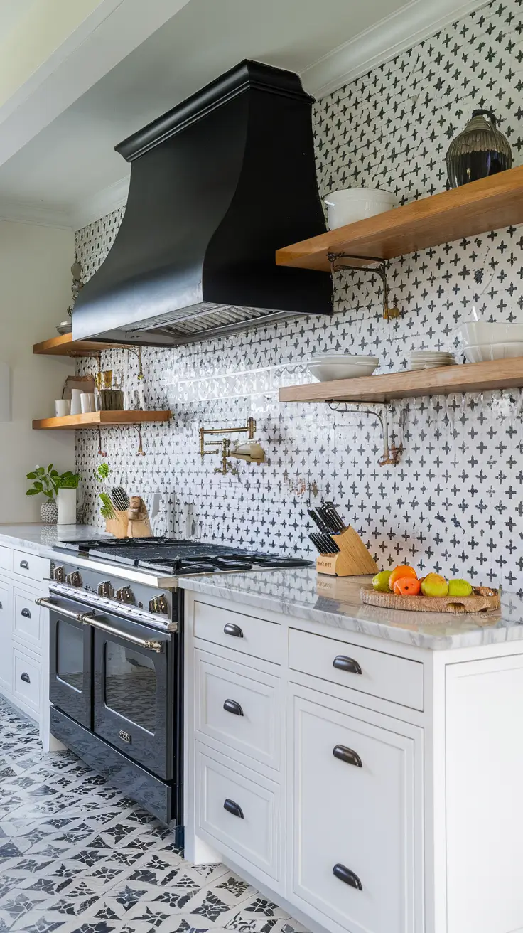
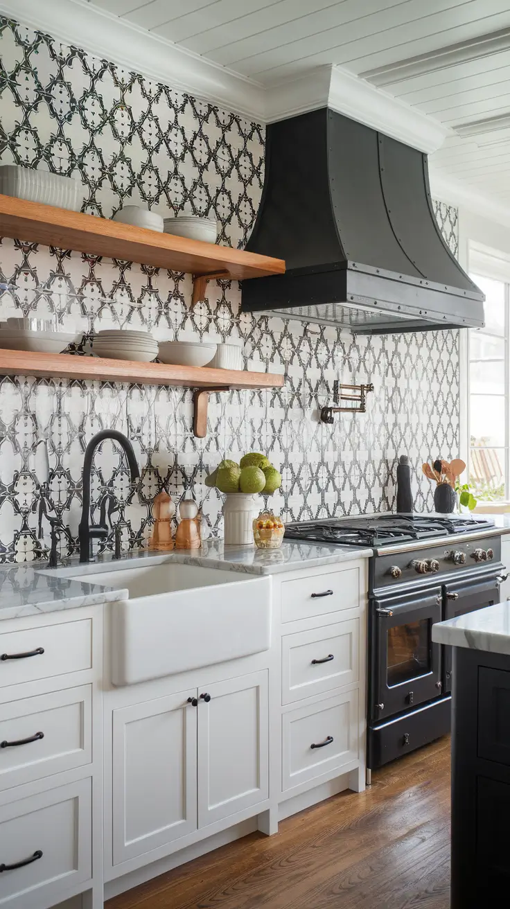
Patterned Backsplash Styles That Tell a Story
When a kitchen needs personality, Patterned tile is my go-to. Moroccan-inspired Mosaic, Mexican tile with hand-painted motifs, or a subtle French country repeat can transform simple White cabinets or Grey cabinets into a showpiece. I keep counters calm and walls uncluttered so the Patterned surface becomes the narrative.

I select patterns with a limited color family – Blue and White, Green and cream, or Black and white – to stay cohesive. With Dark cabinets, I scale the pattern larger so it does not feel fussy; with White cabinets, a smaller repeat can add texture without stealing all attention. Edge trims, pencil liners, or a stone border frame the feature zone neatly.
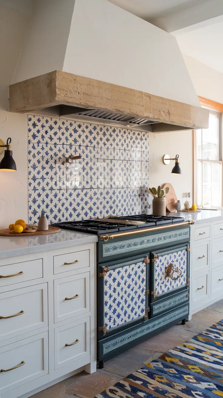
From experience, grout color makes or breaks Patterned installations. I match grout to the lightest tone in the tile to avoid grid lines fighting the design. Many respected tile pros in the US recommend ordering 10 to 15 percent overage so pattern matching stays crisp around outlets and corners. I always do this.
If anything is missing, it is a quiet landing spot. Add a plain field tile adjacent to the pattern near the sink or coffee station to visually rest the eye and make future repairs simpler.
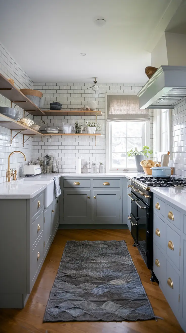
Grey Cabinet Backsplashes for Balanced Modernity
Grey cabinets are a smart middle ground between White and Dark. For 2026, I like pairing Grey cabinets with either White subway tile in a vertical stack for a modern read or Zellige tile in a pale Grey for handcrafted depth. Both options keep the envelope Neutral and let hardware, lighting, and decor shine.
I add contrast with Black fixtures, a fluted oak island, and stone-look porcelain floors that hide daily wear. If the room needs color, a gentle Blue range or a single Green appliance panel feels Unique without sacrificing balance. With White countertops, I introduce a slightly warmer Grey tile; with Black countertops, I go lighter so the wall does not feel too Dark.
My rule of thumb is to let one surface be quietly reflective. A soft-gloss tile bounces light in small kitchens, while a matte tile calms glare in bright, open plans. Trade sources often note that sheen is as impactful as color in perceived brightness, and I find that true.
I would add under-cabinet lighting on a dimmer to make the backsplash glow at night. It is a small upgrade that dramatically elevates Grey cabinet kitchens.
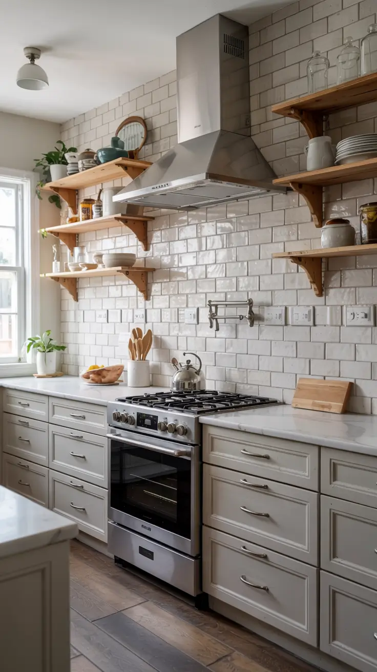
Subway Tile Backsplashes Reinvented for 2026
I approach 2026 subway tile with fresh geometry and artisan surfaces. Instead of default White in a running bond, I rotate layouts vertically, mix lengths, or blend matte and gloss to catch light without glare. This keeps the look Timeless, Unique, and compatible with White cabinets, Grey cabinets, and even Dark cabinets. In compact kitchens, a taller vertical stack subtly raises the eye line, which I find especially helpful with Black and white schemes or White cabinets black countertops where contrast is already high.
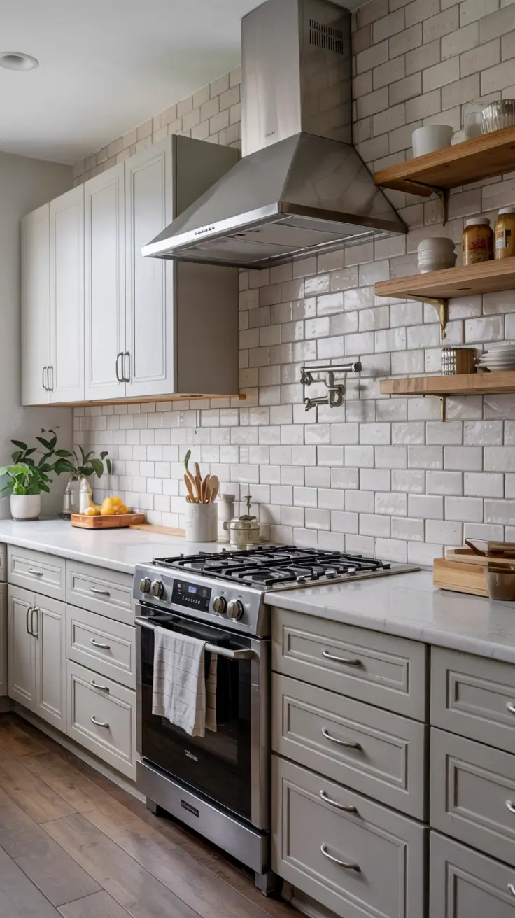
Material and proportion do the heavy lifting. I often specify elongated 2×10 or 2×12 porcelain in warm Neutral whites, a soft Grey, or powder Blue for gentle color. With Brown cabinets or Oak cabinets, I warm the wall using bone or linen glazes. Where clients want edge character, I bring in hand-pressed or lightly irregular edges reminiscent of Zellige tile but with easier wipe-down. I pair with a pencil or bullnose edge so terminations look intentional, and I keep outlets aligned on a single rail.
Based on installs I have revisited, grout is where subway succeeds or fails. I match grout to the tile for quiet texture when counters are Colorful or busy, and I increase contrast only when the rest of the palette is simple. Editors and tile setters alike note that vertical stacks benefit from tight joints to avoid ladder-like lines, so I keep spacing minimal.
I would add a single feature zone – perhaps a framed herringbone insert behind the range in the same color – to honor tradition while keeping the envelope calm. It reads crafted, not trendy.
Sage Green Cabinet Pairings with Soothing Backsplashes
When a client chooses Sage green cabinets, I aim for a backsplash that feels botanical and serene. Pale ecru ceramics, limestone-look porcelain, or creamy White subway tile with soft variation keep the room grounded and light. The palette pairs beautifully with Wood cabinets on an island and brushed brass for warmth, yielding a Country-meets-modern balance that feels Timeless.

Every element earns its keep. I like unlacquered brass or brushed nickel hardware, a plaster hood, and woven stools that add texture without crowding the eye. If the space leans Modern farmhouse, I introduce slim Beadboard or Shiplap on the range wall painted to match the cabinets, then keep the backsplash field quiet. For deeper contrast with Dark stone counters, a milky Zellige tile introduces handcrafted sparkle while staying soothing.

From experience, sage shifts under different lights, so I always test samples in morning and evening. Many US design editors recommend pairing green cabinetry with warm whites rather than stark whites; I follow that guidance to avoid a clinical read. A soft limestone-look porcelain is forgiving of splashes and everyday wear.
I would add botanical art or a herb ledge to echo the palette. A slim oak shelf with terracotta pots ties the look to nature without tipping into theme.
Budget-Friendly Backsplash Ideas That Look Luxurious
When budgets are tight, I focus on smart layout, color, and scale to make affordable materials read upscale. Classic White subway tile laid in a vertical stack with tight grout feels current and polished. A soft Grey grout hides day-to-day marks and pairs with White, Grey, or Brown cabinets. Strategic lighting – under-cabinet bars on a dimmer – adds luxury for little cost.
I keep the spec list practical. Matte porcelain field tile in 4×4 or 2×8 sizes costs less than many mosaics but still looks elevated when wrapped to the ceiling behind shelves. With Ideas white cabinets, I might introduce a skinny tile in pale Blue for personality. With Ideas brown cabinets or Ideas oak cabinets, sand-toned porcelain reads Earthy and calm. For Ideas with dark cabinets, I lighten the wall with creamy tile and a thin matching edge trim to avoid exposed cuts.
I have seen small upgrades do outsized work – aligning outlets in a rail, using color-matched caulk at changes of plane, and installing a minimalist reveal at the counter. Trade pros often remind us that craftsmanship beats material price in perceived quality, and I agree.
I would add one splurge zone. A small framed panel of Mosaic or Mexican tile at the range gives a designer moment while keeping the rest of the wall affordable.
White Cabinets with Black Countertops: Backsplash Balancing Act
This high-contrast pairing is striking but needs a mediator. I reach for soft Grey, warm off-White, or subtle-vein Stone to bridge the jump between White cabinets black countertops. A lightly varied ceramic or honed porcelain slab softens edges while preserving the bold Black and white character that clients love.

Details keep the room livable. I specify satin brass or blackened hardware, a ribbed glass pendant, and oak accents so the space does not feel stark. If the client wants pattern, I use a restrained chevron in the same hue family. With Dark cabinets on the island, I lighten the backsplash further. With Grey cabinets flanking the range, I can introduce a touch more depth on the wall.

In my experience, sheen matters as much as color. A semi-matte tile prevents glare reflecting off black counters and reduces fingerprints. Multiple respected sources in the US market recommend honed rather than polished surfaces for busy kitchens; I follow that for a calmer look.
I would add a thin ledge for art or a clock to humanize the contrast. One organic element – a wood tray or bowl – is enough to warm the composition.
Green Backsplash Designs for Fresh, Vibrant Kitchens
Green backsplashes bring life without shouting. I like celadon, eucalyptus, or bottle-green glazes, each chosen to suit cabinet tones from White to Brown and Oak cabinets. In Coastal homes, sea-glass greens sparkle; in Rustic or Cottage settings, muddier olives read natural and Earthy.
I design the rest of the room to support the hue. With White cabinets, I let green be the star and keep counters Neutral. With Dark cabinets, I scale the tile larger and lighten the grout to avoid a heavy wall. A framed Mosaic or vertical stack at the range adds movement, while flat field tile elsewhere simplifies cleaning. Aged brass, wicker stools, and linen shades reinforce the easy mood.

I have learned to temper saturation. Deep emerald looks stunning in photos but can overpower daily living unless the room is large and bright. Many editors suggest testing bolder greens as an accent first, which aligns with my stepwise approach.
I would add plants and natural ceramics to echo the color, plus dimmable under-cabinet lights to make the glaze glow in the evening.
White Subway Tile Backsplashes: Classic with a Twist
I still love White subway tile, and the 2026 twist is in proportion, layout, and finish. Slim 1.5×10 sticks, micro-bevels, or handmade-look edges keep the surface lively. I often run the tile to the ceiling around windows for a bright, airy envelope that suits White, Grey, or Oak cabinets and both Traditional and Modern farmhouse rooms.
Pieces and parts stay considered. I choose color-matched grout for a serene field, then add a subtle picture-frame at the range. With Brown cabinets or Dark cabinets, I pick a warmer white to avoid chalky contrast. With Black fixtures and a Black and white palette, I sometimes add a single Blue or Green inlay line for a barely-there stripe.
My field notes echo what many tile pros say – small layout adjustments change everything. Align the first course with the counter reveal, keep outlets in a consistent line, and wrap inside corners cleanly. These moves read custom even with everyday materials.
I would add a tactile moment like a fluted niche or a small ledge for oils near the cooktop. Function plus texture is the winning combo.
Stone and Zellige Tile Backsplashes Defining 2026 Trends
Two materials dominate my 2026 boards – honed Stone and handcrafted Zellige tile. Stone slabs bring seamless elegance, perfect with Grey cabinets, Dark cabinets, or White cabinets seeking a gallery-like calm. Zellige offers shimmer and depth in White, Grey, muted Blue, or soft Green, landing between rustic and refined for Rustic farmhouse or French country spaces.

I choose the right partner surfaces. With stone, I keep hardware minimal and let veining lead the palette. With Zellige, I calm the rest – plain counters, simple pendants, and wood accents. When pairing with Brown cabinets or Oak cabinets, I tune warmth carefully so undertones align. For Outdoor covered kitchens, I reserve Zellige for protected walls and use porcelain elsewhere to balance beauty and durability.
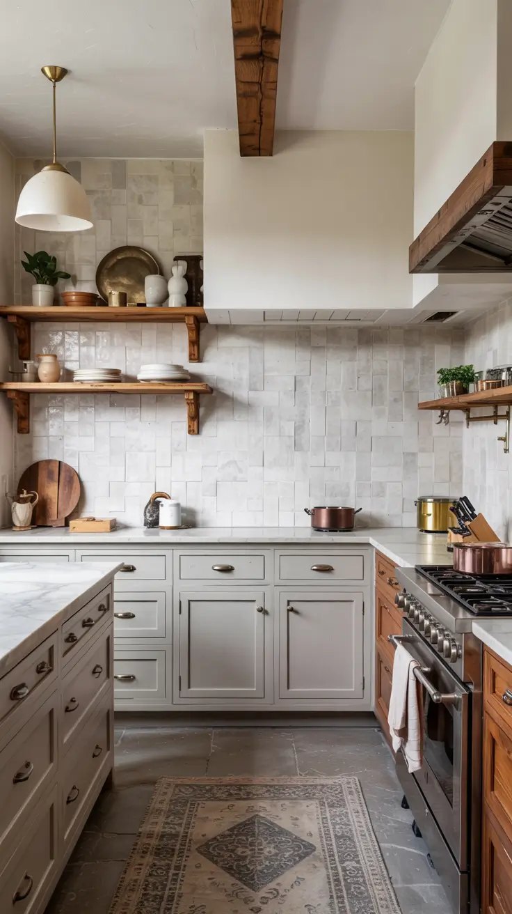
Experience has taught me to vet samples thoroughly. Zellige varies in thickness and glaze, so I plan for lippage and specify a skilled installer. For stone, I evaluate seam placement and backsplash height relative to outlets. Many US fabricators recommend a honed finish to resist etching and to photograph softly under LEDs.
I would add a maintenance note to the spec sheet. Seal stone on install and at intervals, test cleaners on offcuts, and expect Zellige to show charming imperfections – that is its point.